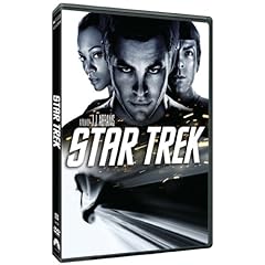
Here's the new STAR TREK box art:
They have rectified a few of my complaints. Let's review:
1.) People's faces
Check. THREE people's faces. Nice job.
2.) A chick
Check! ONE chick.
3.) Explosions
Still no explosions but a close inspection does reveal sparks are flying as if something is being welded nearby, so that's close.
4.) Memorable scenes from the movie
Not quite. . . but the picture of the Enterprise flying through space looks way more action packed here than it does without the faces and sparks added, so again, close.
5.) Vehicles
Still just the Enterprise. Really a shame they couldn't have added that sweet car or Kirk's motorcycle.
6.) Colors
Again, kind of dropping the ball here but closer observation reveals the afore-mentioned welding sparks ARE actually in color. Nice. Still, it doesn't accurately represent one of the best aspects of the movie which is just how pretty it is to look at.
You're welcome, Paramount Pictures.
No comments:
Post a Comment